Generally, colors are classified into three groups: warm colors (red, orange, yellow), cool colors (blue, green, purple), and neutral colors (black, white, brown). Warm colors are typically utilized in graphic design to generate a strong emotion. Thus, a large majority of advisory signs on the roads follow these guidelines.
MODERN DAY SIGNAGE: Color and Meanings:
Red
If a sign is directly commanding you to do (or not to do) something, odds are it is red. For example, “Stop,” “Yield,” and “Do Not Enter” signs are all red, with the most crucial information on the road communicated through the use of either entirely red signs or white signs with red text.
Red signs indicate the most important advisory information on the road
Orange and Yellow
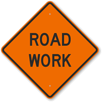
Similarly, warm colors are used to inform motorists of temporary and permanent hazards. Temporary cautions, typically due to construction, have always employed the color orange with black text, while permanent cautions use back text on a yellow backing for maximum readability and visibility. In the past, the most important messages were placed on yellow signs due to their maximal visibility throughout the day and night. The Manual on Uniform Traffic Control Devices (MUTCD) reports that orange signage was not employed until 1964, in response to a larger prevalence of highway construction combined with the release of reflective aluminum materials for increased visibility. Orange continues to be the standard color for construction zones to this day.
Orange signs, such as this Road Work sign, indicate more ephemeral hazard
Yellow signs like this one indicate a permanent hazard, such as pedestrian-heavy areas
Green, Blue and Brown
Less crucial information (that is, information that does not immediately influence the motorist’s action) is generally placed on neutral or cool colored signs. This coloring is intentionally employed as to not command the driver’s attention. The universally recognizable green color on highway exit and directional signs designates information that is purely contingent upon the driver’s intention. Blue signage indicates rest stops and restaurants, and brown designates a location for outdoor recreation. These colors are naturally non-distractive earth tones, intended not to disturb or advise but rather to inform.
Green and Blue signs, such as exit markers and rest area, feature cooler colors as not to distract the driver
Brown designates a location for outdoor recreation
Black and White
The primary focus of a black and white sign is clarity. The majority of black and white signs are advisory, giving motorists information that impacts their speed and indicates upcoming potential hazards. Many advisory signs simply feature black text on a white background, meaning to plainly and visibly inform drivers without distraction. Speed limit signs, movement regulations, one way signs, and railroad crossing signs are all exclusively black and white, devoid of color to promote an informatory aesthetic.
Black and white signs, such as these keep right, speed limit, and railroad signs are devoid of color to designate a more informatory aesthetic
read more


